A Matter of Half a Degree

Shortly after the IPCC report was released, I went along to an Energy & Climate Intelligence Unit event where Jim Skea was guest speaking. Jim is co-chair of the IPCC and a distinguished scientist. He’s also a communicator, which came as a nice surprise. Listening to your average scientist can be punishingly boring. Jim was not your average scientist.
He took his audience, carefully and succinctly, through the report’s four key messages:
- Climate change is already affecting people, ecosystems and livelihoods all around the world.
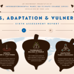
- Limiting warming to 1.5°C is not impossible but would require rapid, far-reaching and unprecedented transitions in all aspects of society. (See our infographic on what it would take for us to have a crack at 1.5°C.)
- There are clear benefits to keeping global warming to 1.5°C compared to 2°C or higher; every bit of warming matters.
- Limiting warming to 1.5°C can go hand in hand with achieving other world goals.
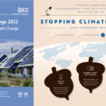
The above infographic very obviously deals with the report’s third key message — the benefits of keeping warming to 1.5°C rather than 2°C. But if it’s to be analysed honestly, 2°C is a bit of a red herring. The “or higher; every bit of warming matters” is the more important part. Don’t get me wrong, providing reference points — the Paris Agreement’s 1.5°C and 2°C targets — is a useful, even insightful, tactic — but it’s neither instructive of what’s actually happening nor what’s likely to happen.
Presentation is everything
The IPCC produced this report based on an invite by the United Nations, but they could have done things differently. For example, they chose not to highlight the difference between a 1.5°C and 3.2°C warmer world — the temperature increase we’re heading for by 2100 if nothing else is done by countries to strengthen existing Paris Agreement pledges. (Meanwhile, Donald Trump and Australia are pulling further away from even that level of commitment.)
This helpful interactive graphic by Carbon Brief is light years ahead of what we produced. They extracted data from 70 peer-reviewed climate studies to show how global warming is projected to affect the world and its regions. At 1.5°C, 2°C and most importantly beyond. Leonardo DiCaprio even tracked it down:
Wow! I think I’ve peaked… https://t.co/vd9vsZSOlH
— Rosamund Pearce (@_rospearce) 18 October 2018
The reality
The world’s temperature is now changing 50 times faster than it did during the time when modern civilisation and agriculture developed — that’s the last 11,000 years. Humans are releasing carbon dioxide into the atmosphere 14,000 times faster than nature has over the past 600,000 years. In 2017, humans released 36.8 billion tonnes of carbon dioxide into Earth’s atmosphere — effectively thickening the blanket that already drapes over it. And if that weren’t enough, in 2018, emissions are forecast to go up.
Jim finished his presentation with an outline of civilisation’s four pathways to 1.5°C. That’s another story (and another infographic) but it’s a steep — a steep-like-we’ve-never-seen-before — challenge however you look at it. Here’s the sobering preview of how quickly (and steeply) things must change:
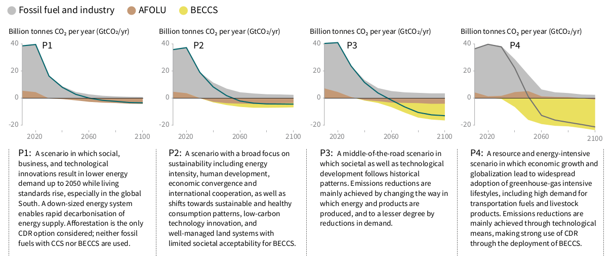
Source: IPCC
As Jim optimistically conceded at the end of his talk, achieving the 1.5°C target “can be done within the laws of physics and chemistry.” But:
“The final tickbox is political will. We cannot answer that. Only our audience can – and that is the governments that receive it.”
If only Jim could’ve been born a scientist, a communicator and a politician.