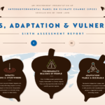
IPCC Explainer: Impacts, Adaptation and Vulnerability
If a picture is worth a thousand words, a 750,000 word IPCC report is logically worth 750 pictures.
Read More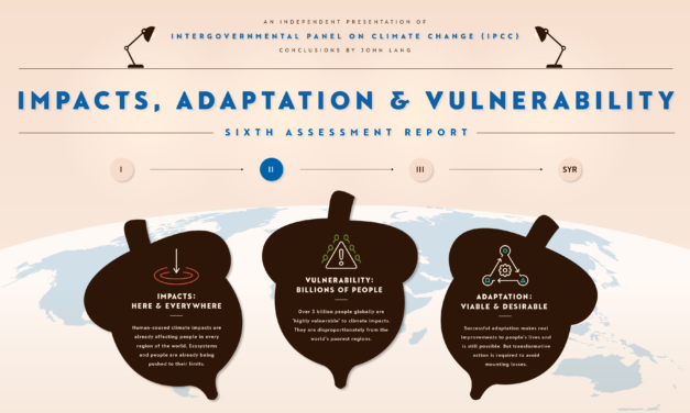
If a picture is worth a thousand words, a 750,000 word IPCC report is logically worth 750 pictures.
Read More
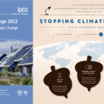
The second instalment of John’s four-part series on the IPCC’s Sixth Assessment Report.
Read More
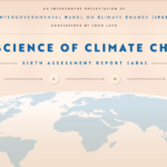
If a picture is worth a thousand words, a 750,000 word IPCC report is logically worth 750 pictures.
Read More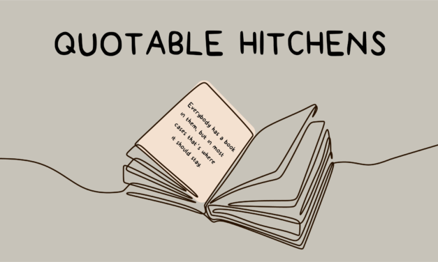
Christopher Hitchens could throw words up into the sky and they fell down in a marvellous pattern.
Read More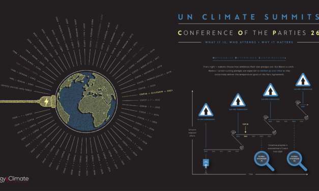
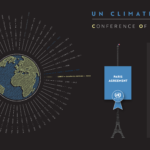
What COP26 is, who attends it and why it matters — in infographic form.
Read More
Navigating the European Union to Net Zero by 2050
Read More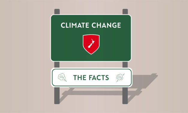
As New Zealand begins its greatest economic transition since the 1980s, here are 10 climate facts to provide some context as to why.
Read More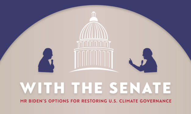
With the slimmest of Senate margins, the Democrats now have an opportunity to pass major climate legislation.
Read More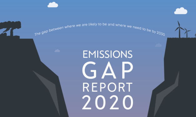
An infographic summary of this year’s UNEP Gap Report. It shows the gulf between where we are likely to be and where we need to be by 2030.
Read More
What Biden can do to restore U.S. Climate governance — with and without a Democratic Party majority in the Senate.
Read More